Create a Levey-Jennings chart in seconds
Levey-Jennings diagrams are an important tool in hematology and medical diagnostics. They help to quickly identify and monitor deviations in laboratory results. But how do you actually create such a diagram?
This is where we at Statistical Consulting and Data Analysis Leonardo Miljko can help you. We have extensive experience in creating Levey-Jennings diagrams and are happy to assist you in creating your own diagrams.
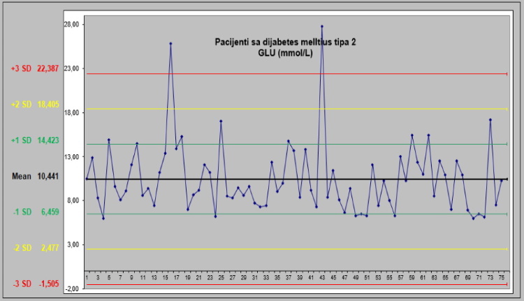
A Levey-Jennings plot is a special case of the usual Shewart Xbar plot that takes only a single stream of data and estimates sigma using the standard deviation of that data. It is used to monitor the performance of laboratory equipment and procedures by comparing the equipment's daily control values against the accepted limits of performance.
The chart shows the control values over a period of time, typically several months. It is usually divided into several areas that represent the standard deviations of the control values. The middle line of the graph shows the average of the control values, while the upper and lower control lines represent the accepted limits of performance.
At Leonardo Miljko Statistical Consulting and Data Analysis we use special software to create Levey-Jennings diagrams quickly and easily. Our experts can import your data and create a customized chart that meets your specific needs in seconds.
With our help, you can quickly identify and correct discrepancies in your laboratory results. Contact us today to learn more about our services.
keywords:
Levey-Jennings diagram, hematology, medical diagnostics, statistical advice and data analysis, Leonardo Miljko, laboratory results, control values
meta text:
Learn how to create a Levey-Jennings plot in seconds and quickly identify discrepancies in your lab results. Statistical advice and data analysis Leonardo Miljko is your partner for reliable data analysis and monitoring in hematology and medical diagnostics. Contact us today to find out more.
"Used Source: ChatGPT"


